Case Study: Redesigning a Preschool App
The app my daughters preschool uses is a communication tool used to check-in and out children and communicate with parents. However, my experience, along with that of other parents, reveled significant usability issues and frustrations with the app's interface. Common complaints included difficulties in navigating the app, accessing important information, and interacting with features such as calendars and messaging. These usability issues include a confusing user flow, dead links and buttons, and multiple pathways to access the messaging function, leading to frustration and dissatisfaction among users.
To address the usability issues plaguing the current app, my approach involved a comprehensive redesign of both the user experience and interface. Below you can see the Figma prototype on your phone and read about how I tackled the project:
-
I began by discussing pain points with many parents and a member of the preschool staff to gain insights into the specific frustrations experienced by users of the Remini app.
-
I researched other daycare and preschool apps. Without a child enrolled in an institution that uses that app, I was unable to gain first-hand experience in using other apps. However, I took into consideration information and examples about functionality from many early childhood communication app providers and combined that with information gained from discussing the app's current functions and Georgia state law requirements from the member of staff I was able to talk to.
-
I first mapped the current information architecture to accurately pinpoint all the app functions and pathways. Then, I created a new map to reflect my suggested flow of the app, incorporating improvements to streamline navigation and enhance user experience. The key features identified for parents included messaging and checking a child in or out of school.
-
After creating a new site map for the app, I started creating wireframes on paper for each screen. After making several versions of each screens I revised my designs into wireframes on figma.
-
After finishing the wireframes in Figma, I created a usable low-fidelity prototype to visualize the redesigned user interface and test different design solutions with users. I sent the prototype to several people along with a google forms questionnaire and record their thoughts on the new vs the old. The results were very positive.
-
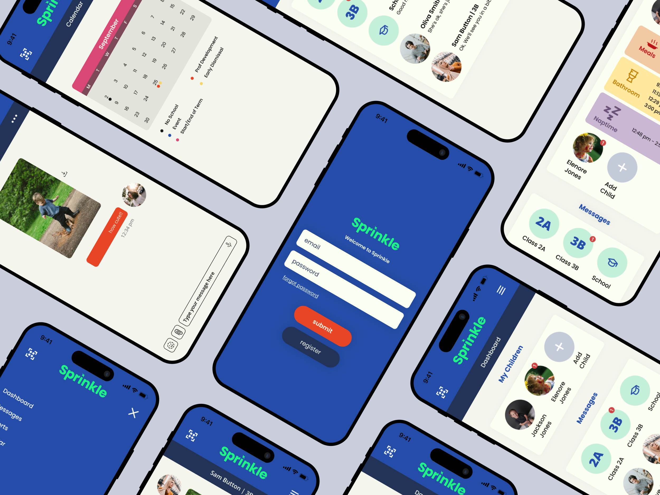
With my feedback in hand, I first made adjustment to my prototype suggested by users. I then created a new brand and logo for the app. I named the app Sprinkle, because the app gives parents sprinkles of their child’s day. Next came new brand colors that reflect the playful and energetic nature of the new brand.
After creating the brand elements, I started work on the user interface design of the app. I updated the low fidelity prototype with new fonts, logos, colors and refined the design until finished.